UNITED STATES DEPARTMENT OF AGRICULTURE
UNITED STATES DEPARTMENT OF AGRICULTURE


Improved the user interface by simplifying the drop-down menu options and selecting a new layout for three important pages. The goal is to improve navigation for the farmers and allow them to easily access the farming information.
PREFACE
USDA is a federal agency responsible for overseeing policies related to farming, agriculture, forestry and food. It aims to support farmers, ensure food safety and promote agricultural trade and protect natural resources.
PROJECT OVERVIEW
Timeline
5 weeks
My Role
UX Researcher & Designer
Tools
Figma, FigJam, Adobe XD, InVision,
The goal of this project is to identify the pain points that farmers experience when using the farming portal and redesign the website with a modern layout, enhanced color theme and a well-structured drop-down menu with organized information.
PROBLEM STATEMENT
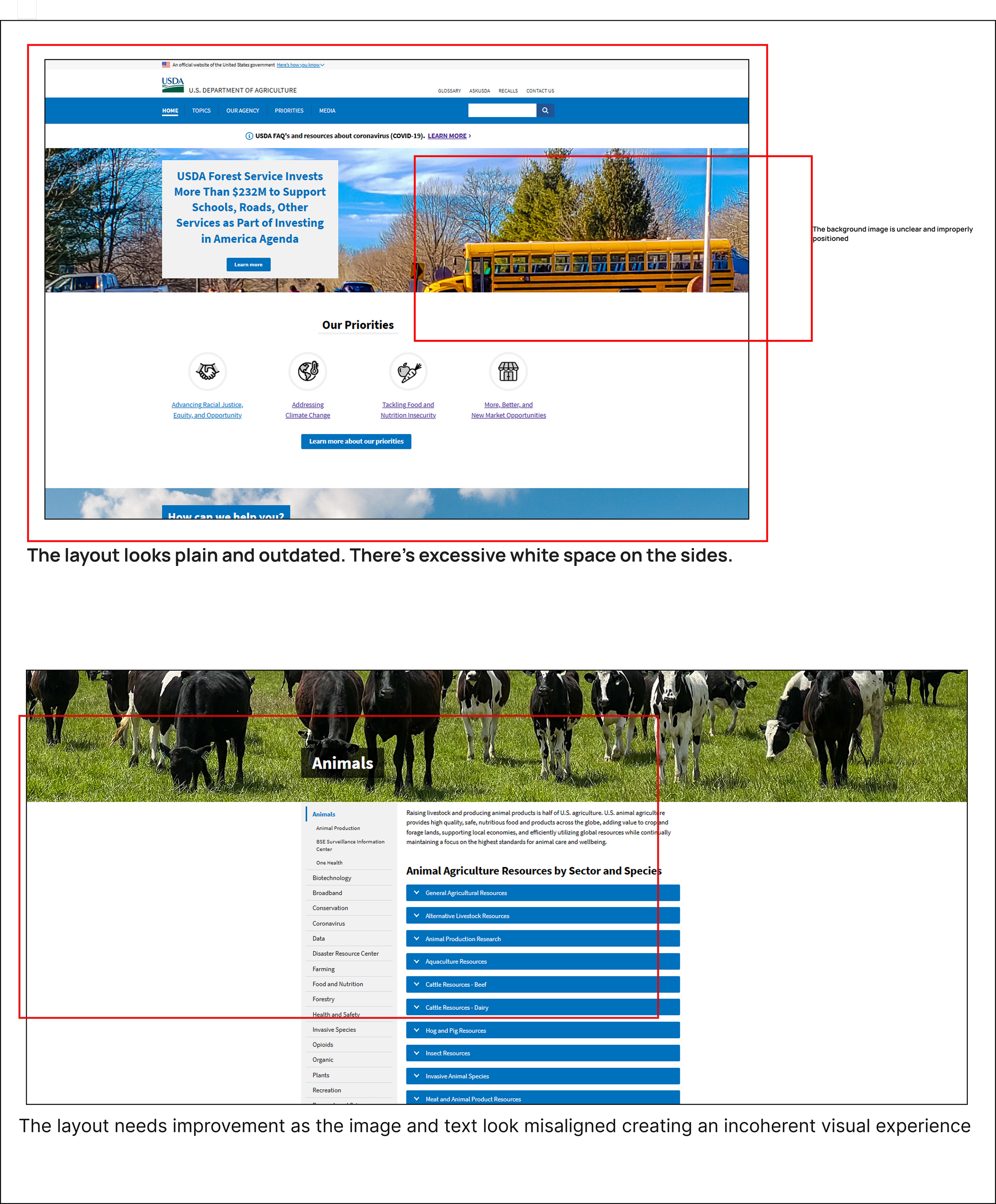
The USDA farming portal lacks a proper structure and layout. While all the information is readily available, the disorganized categories and cluttered content makes it hard for users to access the information they are looking for.

User Research & User Interface Analysis

UX HYPOTHESIS
If we redesign the navigation, content organization, color theme and layout, users will be able to access information more quickly and effortlessly
VALUE PROPOSITION
The redesign makes it easier for farmers to access information and engage meaningfully with the content.
-
![]()
Heuristic Evalutaion
-
![]()
Proto Persona
-
![]()
Card Sorting
-
![]()
Site map


MOODBOARD

CONCEPT DESIGN
DESKTOP VERSION
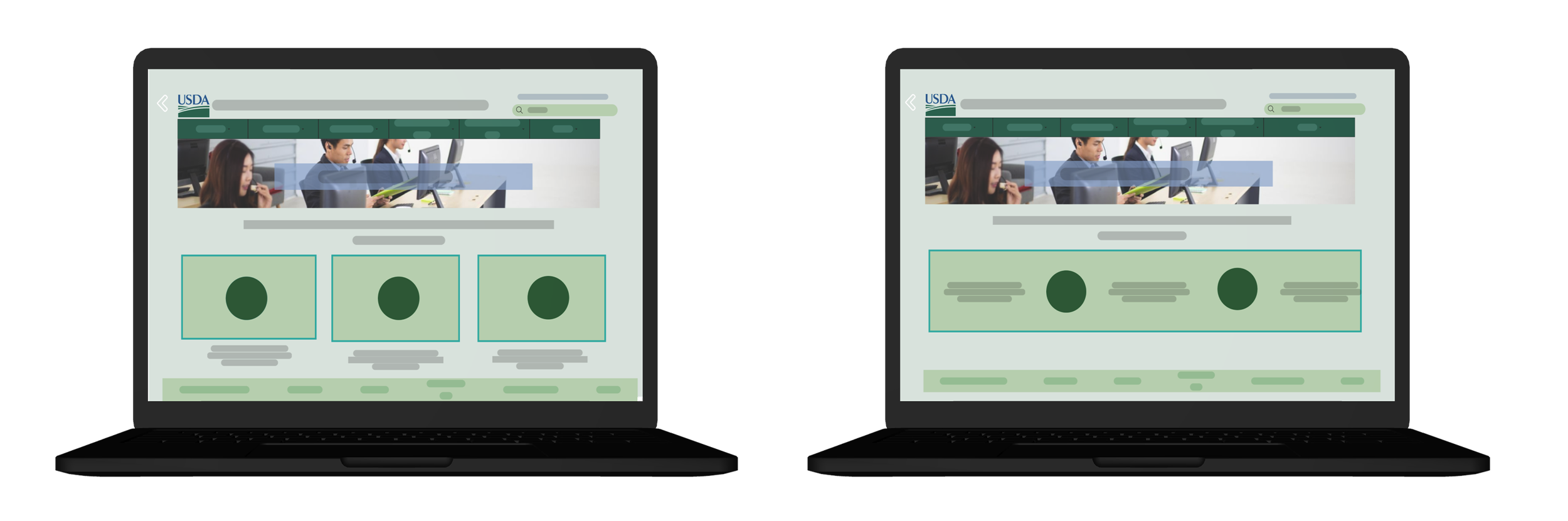
Low-Fidelity Wireframes


Mid-Fidelity Wireframes


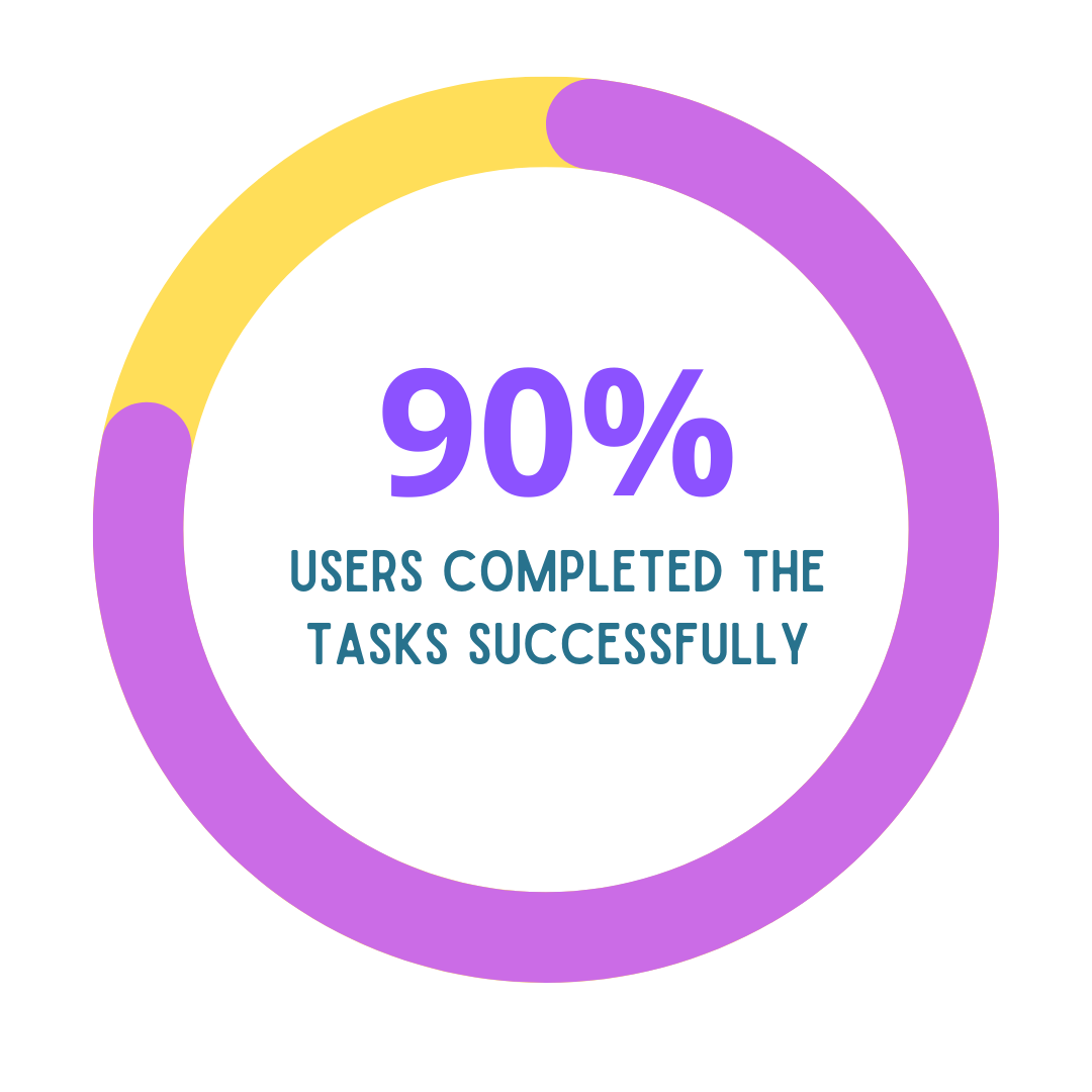
Usability Testing &Iterations
Objective: To evaluate the effectiveness of the redesigned website and closely observe the user’s interaction with the new navigation.
Method: Guerilla Testing Plan
Tools: Zoom
Test Scenario: Specific tasks were developed, and participants were asked to perform them


UI DESIGN
Once the usability issues were resolved, the next step was to move on to design the final screens in Figma. The goal was to create a visual identity that’s aligned with the brand’s values and message
REDSIGN IMPLEMENTATIONS
Grouped similar options into concise categories, reduced the number of visible options by consolidating them under relevant categories and enhanced the visual design to create a clean look
REDESIGNED UI ELEMENTS
The redesigned USDA website incorporates a cohesive set of UI elements aimed at enhancing user experience.


Button Styles
IconographyColor GradientButton States

This new color palette is selected to reflect identity of the company and a warm and welcoming atmosphere. The earthy tones symbolize sustainability & growth
UI Style DirectionThe style direction is earthy, simple, and inviting. Lots of earth tones, bright and warm colors with an agricultural and farm feel.TypographyThe font is simple clean and straightforward. It focuses on readability and ensures that users can easily absorb informationH1 - Roboto Slab (Bold) - 23 PTSubtitle -Roboto - 18 PTH2 - Alatsi - 32 PTSubtitle - Abaya Libre (Semibold) - 28 PTParagraph - Abhaya Libre - 28 PTQuote Style - Roboto Italic - 18 PTThe font is simple clean and straightforward. It focuses on readability and ensures users easily absorb information

The color gradient is applied strategically to the backgrounds,blending complementary colors that align with USDA identity and standardsThe images and illustrations are curated to depict the sustainable practices and agricultural landscapes

FINAL DESIGN
The redesign of USDA marks a significant step towards enhancing user experience, accessibility and engagement. Through comprehensive user research a more intuitive interface has been developed that meets the needs of diverse audience
Key Learnings
Engaging with users early in the design process provided valuable insights into their needs and behaviors
Regular iterations are essential to maintaining high accessibility standard
Ensuring that the website is intuitive and accessible to all users is a continuous process