TRIPSPLIT - A Fintech Saas Tool

Project Overview
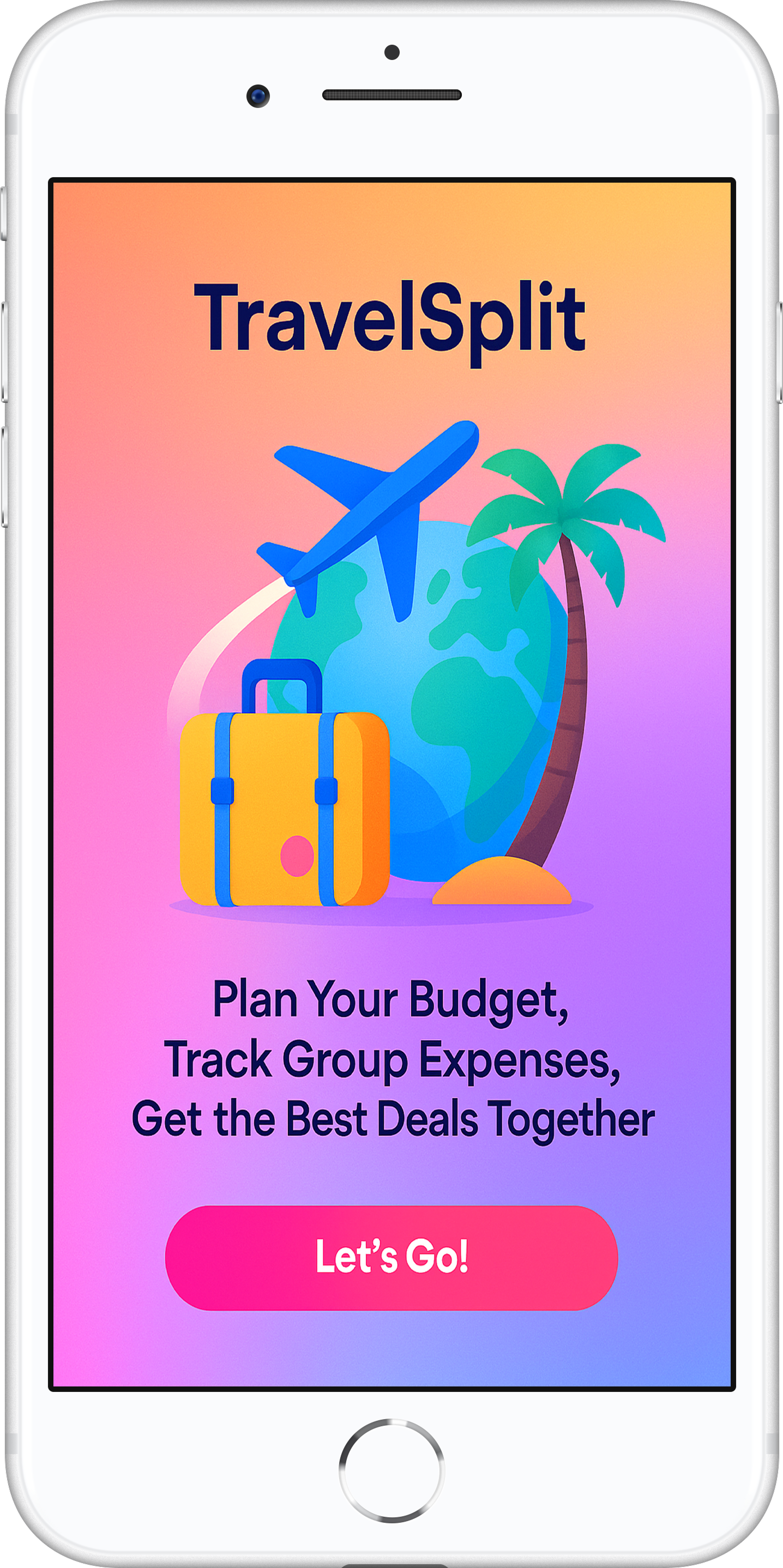
TravelSplit is Fintech Saas mobile application that allows users to track, split, and manage travel-related expenses with friends or groups. It simplifies trip budgeting by automating calculations, tracking who owes what, and offering visual summaries all tailored specifically for short group trips.
Timeline - 5 weeks My role - Product Designer Tools - Figma, Adobe XD
PROBLEM SPACE
Groups traveling together often face confusion over splitting shared expenses like accommodation, transportation, and food. Manual tracking through chats and spreadsheets leads to errors, forgotten debts, and awkward reminders
HOW MIGHT WE?
How might we help users easily split group travel expenses without causing confusion?
ULTIMATE IMPACT
Reduce interpersonal friction during group travel by providing a fair, and collaborative expense-sharing experience, making group trips more enjoyable and financially transparent.
ASSUMPTIONS
Groups prefer to settle expenses after or during the trip
One person typically leads the finance coordination
Currency conversion is not needed in MVP
CONSTRAINTS
Not implementing real payment gateways in prototype
Limited time and budget as this was a bootcamp project
PROBLEM STATEMENT
Group travelers currently lack a dedicated, intuitive tool to manage shared expenses during trips. Existing solutions are too generic or complicated, resulting in poor tracking, delayed reimbursements, and discomfort around money matters.
USER RESEARCH & DESIGN PROCESS
UX HYPOTHESIS
We believe that creating a simple, travel-focused expense-sharing platform will help group travelers manage costs transparently and reduce confusion and interpersonal conflict.
VALUE PROPOSITION
TravelSplit empowers group travelers to track, split, and settle shared travel expenses with minimal effort, visual clarity, and collaborative transparency—on any device, from anywhere.
INITIAL INTERVIEW FINDINGS
3/5 said they relied on WhatsApp or verbal reminders to track expenses
4/5 forgot to track small daily expenses
5/5 were unsure “who owed what” by the end of the trip
2/5 found Splitwise too feature-heavy or generic
Preferred simple UI, mobile accessibility, and friendly reminders
-
![]()
Proto Persona - Emily wants to contribute to a global cause but doesn't feel motivated to use the UNICEF website
-
![]()
Affinity Diagram - From the user interviews, it was clear that the users wanted a website that is both functional and resonates with them on an emtional level
-
![]()
Card Sorting
-
![]()
User Persona - Kristen wants to donate the UNICEF website but she feels the layout is too dull and dark
-
![]()
User Scenario - Kristen doesn't feel connected to the website and feels that the layout is too dark. However, she decides to sign up as she's drawn by UNICEF's mission and want to support it.


TASK FLOW
User Goal: Record and split a dinner bill paid by one person
Open app and select trip
Tap “Add Expense”
Enter title, amount, category
Select who paid and who should split it
App auto-calculates each member’s share
Press “Save”
Balance updates immediately
Mid-Fidelity Screens


USABILITY TESTING
Objective - To evaluate the effective of certain features of the app and whether the user can easily use navigate easily.
Participants: 5 users (2 frequent travelers, 2 roommates, 1 solo tester unfamiliar with split apps)
Method: Moderated remote testing via Zoom
Tools Used: Figma interactive prototype, Observation grid, Google Forms post-test survey
Tasks:
Add a new group expense
View current balances
Edit a previous expense
Send a reminder to a friend
Results:
4/5 found the interface intuitive and completed all tasks
3/5 were unsure where to find “Send Reminder” (iterated to surface this action)
2/5 expected visual summary earlier on the home screen
Positive feedback on mobile-optimized UI and clarity of balances
ITERATIONS

High-Fidelity Screens


Conclusion & Key Learnings
Users appreciate simplicity and clarity in money-related apps, especially during trips
Visuals (like pie charts) help reduce anxiety around shared finances
Friendly, non-confrontational reminders are essential
Navigation hierarchy matters, a “flat” structure worked better than nested menus
Designing for emotional comfort is just as important as technical usability in fintech contexts