UNICEF USA
UNICEF USA


AMPLIFYING IMPACT THROUGH VISUAL DESIGN
In this project, the focus shifts to an engaging aesthetics and an easy to donate feature that represent children and encourage users to contribute and donate the cause
PREFACE
UNICEF (United Nations International Children's Emergency Fund) is a global organization that works to protect the rights and well-being of children worldwide. Established in 1946, UNICEF provides humanitarian and developmental aid to children in over 190 countries and territories. The organization's focus areas include education, healthcare, nutrition, clean water and sanitation, emergency relief, and advocacy for children's rights. UNICEF is committed to ensuring that every child has the opportunity to grow up in a safe, healthy, and supportive environment
Timeline
8 weeks
My Role
Visual Designer
Tools
Figma, Adobe XD, Trella, Zoom
PROBLEM SPACE
Non-profit organizations often face challenges in securing support for their initiatives. It is crucial to understand how potential donors interact with the websites and the key elements influencing their donation considerations
HOW MIGHT WE?
How might we redesign the aesthetics for UNICEF USA that enhances user experience and encourages them to make donations, ensuring that it also reflects the positive impact and energy of the children welfare cause?
ULTIMATE IMPACT

I want to shift the current website theme to a more colorful and vibrant design displaying visuals that foster hope and positivity, encouraging users to explore the site and feel inspired to donate. My goal is to enhance the visual appeal and enhance the CTA by incorporating colors and happier images that strongly represent UNICEF USA’s mission
ASSUMPTIONS
A website dedicated to children's welfare should be vibrant and colorful as these elements are more likely to engage people. Dark and somber themes are uninviting and may deter potential users from making donations and exploring the content
CONSTRAINTS
The redesign had to align with UNICEF’s brand identity, ensuring consistency in the visual elements and allowing updates to the navigational features. Further, the project was to be completed within a tight timeline requiring prioritization of key elements only

PROBLEM STATMENT
The current UNICEF website features a predominantly dark theme with black background color, which does not fully capture the essence of its mission. As soon as users visit the site, they are shown a donation pop-up which may inadvertently create a disconnect and reduce their willingness to explore the site further. The gap in visual appeal and usability hinders the website’s potential to inspire the visitors to take action
UX HYPOTHESIS
By redesigning the UNICEF website with a vibrant theme and a simpler donation flow, the user will likely explore the site and feel a stronger emotional connection with the content
VALUE PROPOSITION
The redesigned UNICEF USA website with vibrant visuals and an easy to donate feature will inspire greater user engagement. People will be encouraged to donate which will drive meaningful action in the future
Interview Findings
It was identified that all participants immediately closed the donation pop-up as they first wanted to see what they are donating to. Moreover, most of the participants believe that the dark and serious tone of the website feels disconnected from the hopeful spirit of UNICEF mission

Proto Persona, Card Sorting, Affinity Diagram, User Persona, User Scenario
It all starts with an idea
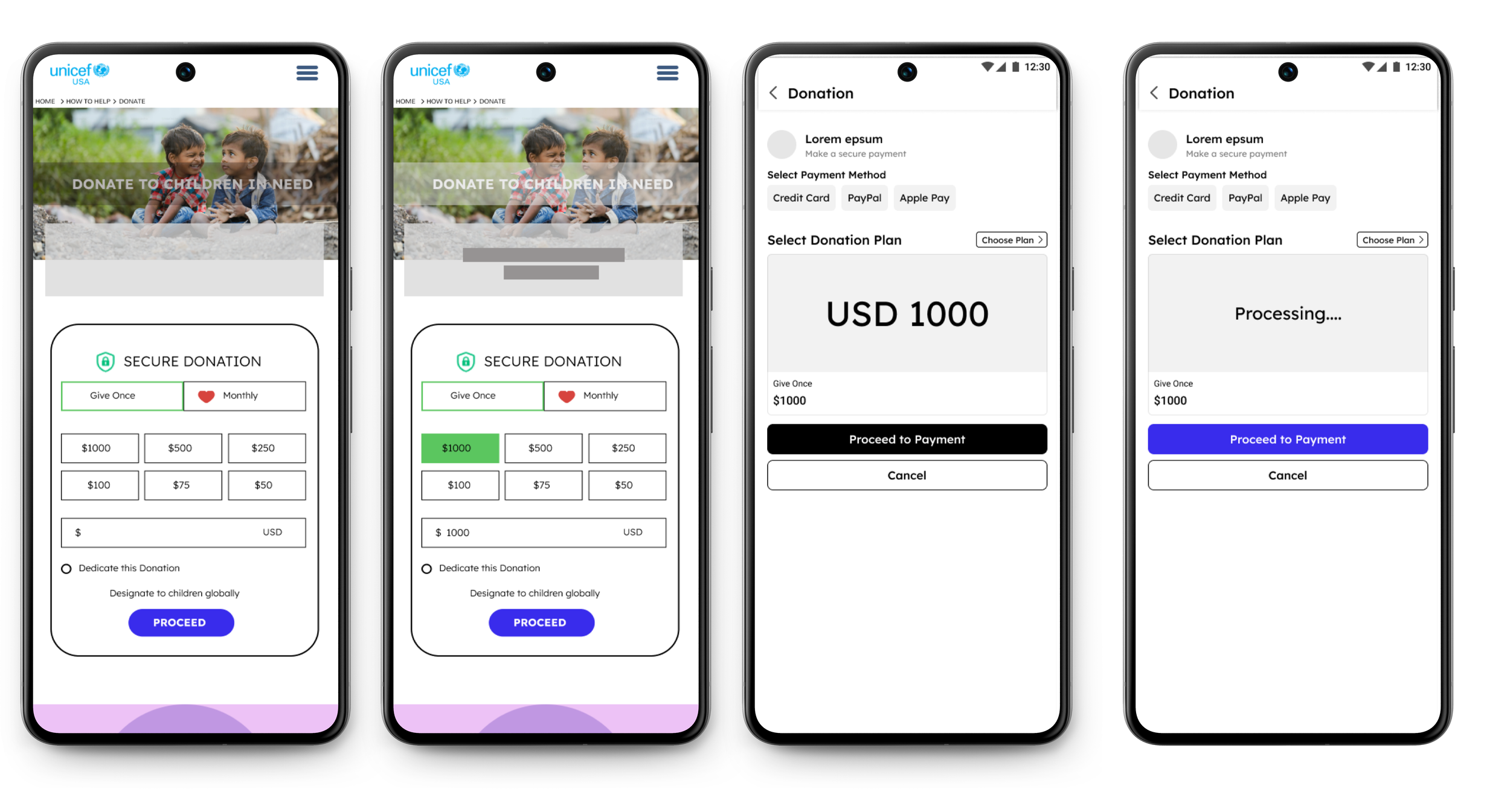
The task flow shows the new donation flow starting from the Donate Page instead of the pop-up


Low-Fidelity Wireframes
Mid-Fidelity Wireframes
Usability Testing & Iterations

Objective - To analyze evaluate whether the redesigned donation feature is intuitive, the overall layout feels engaging and users can easily explore key features in the mobile version.
Participants - 8 participants aged 22 - 42 who have previously made online donations and are familiar with UNICEF
Interview Method - Zoom & In-person

Redesigned UI Elements

The redesigned visual elements included color palette, iconography, CTAs and font styles.


